You are using an out of date browser. It may not display this or other websites correctly.
You should upgrade or use an alternative browser.
You should upgrade or use an alternative browser.
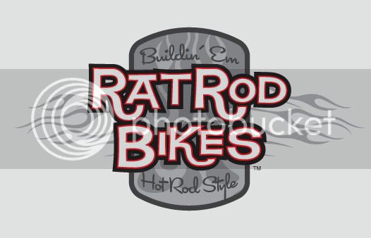
NEW RRB LOGO (FINAL SHIRT DESIGN)
- Thread starter Rat Rod
- Start date


Help Support Rat Rod Bikes Bicycle Forum:
This site may earn a commission from merchant affiliate
links, including eBay, Amazon, and others.


Re: NEW RRB LOGO
Yes it needs something related to a bike, but it does look cool.
Yes it needs something related to a bike, but it does look cool.
Rat Rod
Owner & Founder
Re: NEW RRB LOGO
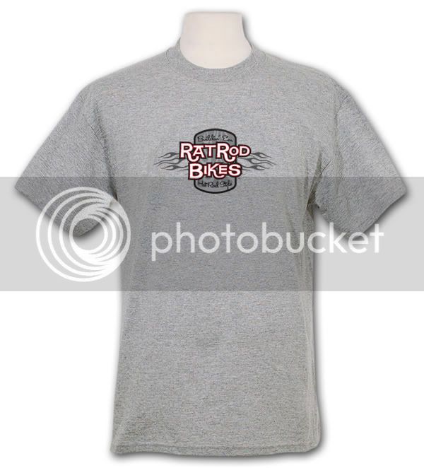
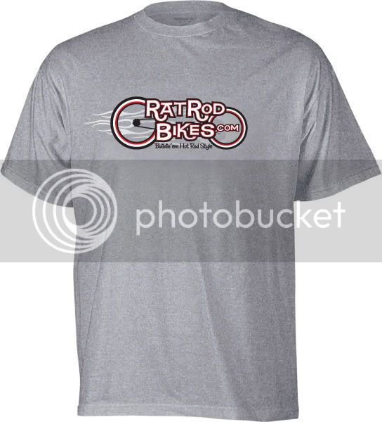
I'm thinking the badge would look sweet on the front of a shirt (centered).
Maybe print the URL version small on the back centered up near the top by the collar.
Will work on a mock up for that soon.
I'm thinking the badge would look sweet on the front of a shirt (centered).
Maybe print the URL version small on the back centered up near the top by the collar.
Will work on a mock up for that soon.
Re: NEW RRB LOGO
Rat (Sir),
I like the Badge... It's COOL!
The other side (back) should be big enough to read from a distance though... Don't want no teensy tiny little thing... WANNA SHOW IT!
Sorry, soap box now removed, and back to my normal lurking.
Rat Royale
REC Elsewhere
Rat Rod said:I'm thinking the badge would look sweet on the front of a shirt (centered).
Maybe print the URL version small on the back centered up near the top by the collar.
Will work on a mock up for that soon.
Rat (Sir),
I like the Badge... It's COOL!
The other side (back) should be big enough to read from a distance though... Don't want no teensy tiny little thing... WANNA SHOW IT!
Sorry, soap box now removed, and back to my normal lurking.
Rat Royale
REC Elsewhere
Re: NEW RRB LOGO
Shirt looks good, but I just wish that the last style was still around. I really liked them, and only got one of them.
Also do you think that it would be confused with motorcycles?
Shirt looks good, but I just wish that the last style was still around. I really liked them, and only got one of them.
Also do you think that it would be confused with motorcycles?
Re: NEW RRB LOGO
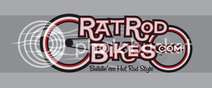
I think instead of the shape of a grille shell/shield it should be a wheel or chain ring otherwise I like it a lot. Myself, I like shirts with a large graphic on the back and a smaller one on the left chest area. Just my 2cents.
I think instead of the shape of a grille shell/shield it should be a wheel or chain ring otherwise I like it a lot. Myself, I like shirts with a large graphic on the back and a smaller one on the left chest area. Just my 2cents.
Re: NEW RRB LOGO
but i like the occasional big logo on front centered with small link type thing on the rear near the neck centered
maybe on the left arm too
I Like that format tooBoardtrack fan said:I think instead of the shape of a grille shell/shield it should be a wheel or chain ring otherwise I like it a lot. Myself, I like shirts with a large graphic on the back and a smaller one on the left chest area. Just my 2cents.
but i like the occasional big logo on front centered with small link type thing on the rear near the neck centered
maybe on the left arm too
Re: NEW RRB LOGO
NIIIIICE!!
NIIIIICE!!
Re: NEW RRB LOGO
The font reminds me of what you'd see under an old Ed Roth drawing. Does the style have a name?
The font reminds me of what you'd see under an old Ed Roth drawing. Does the style have a name?
Rat Rod
Owner & Founder
Re: NEW RRB LOGO
Yes it does...and it's top secret. :lol:
I purchased the font and then modified it in several ways to come up with the logo.
I've been on the look out for something a bit more fun for a while now...I saw it and thought...yep, that's the one.
GodHatesCleveland said:The font reminds me of what you'd see under an old Ed Roth drawing. Does the style have a name?
Yes it does...and it's top secret. :lol:
I purchased the font and then modified it in several ways to come up with the logo.
I've been on the look out for something a bit more fun for a while now...I saw it and thought...yep, that's the one.
Re: NEW RRB LOGO
This would be a great sticker for the crossbar of a bike, or on a chainguard even.
Rat Rod said:
This would be a great sticker for the crossbar of a bike, or on a chainguard even.
Re: NEW RRB LOGO
Steve,
A couple of suggestions. Use the tophat of the 'A' in RAT to make a seat and then somehow integrate the 'OD' in ROD into a set of handle bars and then I think you have it! It kinda looks like a convertible with the top down as it is.
My .02.
Joe
Steve,
A couple of suggestions. Use the tophat of the 'A' in RAT to make a seat and then somehow integrate the 'OD' in ROD into a set of handle bars and then I think you have it! It kinda looks like a convertible with the top down as it is.
My .02.
Joe
Rat Rod said:
Re: NEW RRB LOGO
I like the font. The first logo I think the flame is a bit played out. The second one is a bit left side heavy, but like the other have said it relates to bikes more, so I like it more than the first one. You are getting there maybe play with some of the elements on both pieces and make something out of it.
I like the font. The first logo I think the flame is a bit played out. The second one is a bit left side heavy, but like the other have said it relates to bikes more, so I like it more than the first one. You are getting there maybe play with some of the elements on both pieces and make something out of it.